Components
A component (also called a block) is a building piece you add to your page: a button, an image, a row of columns, an embedded video, and so on. You build a whole page by combining components and styling them.
Adding a component
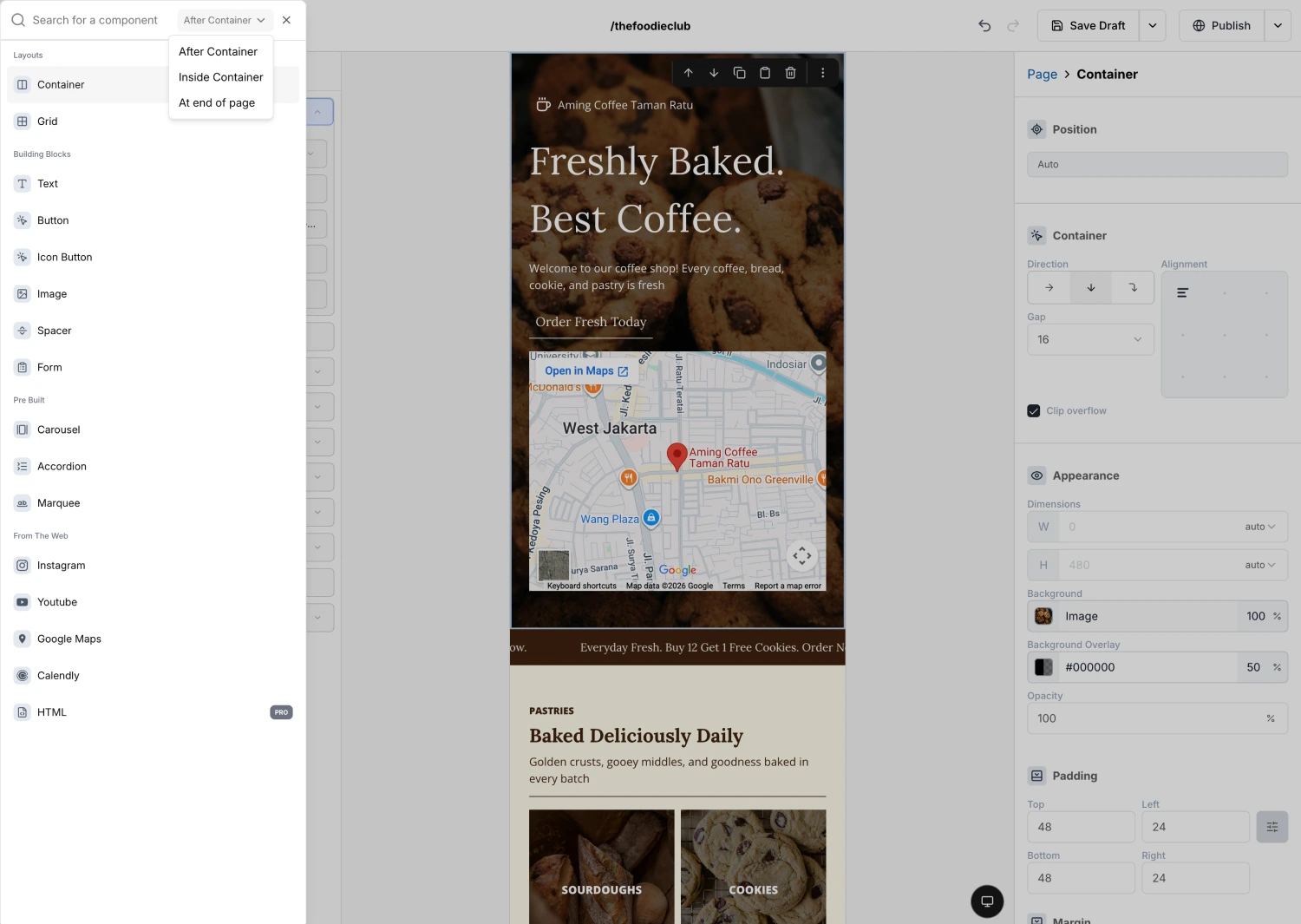
You add a component with the Insert menu: click the plus button (or press ⌘ /), search for the block you want, choose where it goes, and click it. There is no dragging.
EditorInsert (⌘/)Building BlocksButtonFor the full walkthrough, including how to place a block after another or inside a Container, see Adding Components.
The categories
- Layouts hold and arrange other blocks. Start here to structure a section. See Container and Grid.
- Building Blocks are the everyday pieces: Text, Button, Icon Button, Image, Spacer, and Form.
- Pre Built are ready-made interactive pieces: Carousel, Accordion, and Marquee.
- From The Web embed content from other services: Instagram, YouTube, Google Maps, Calendly, and raw HTML.
Changing a component's settings
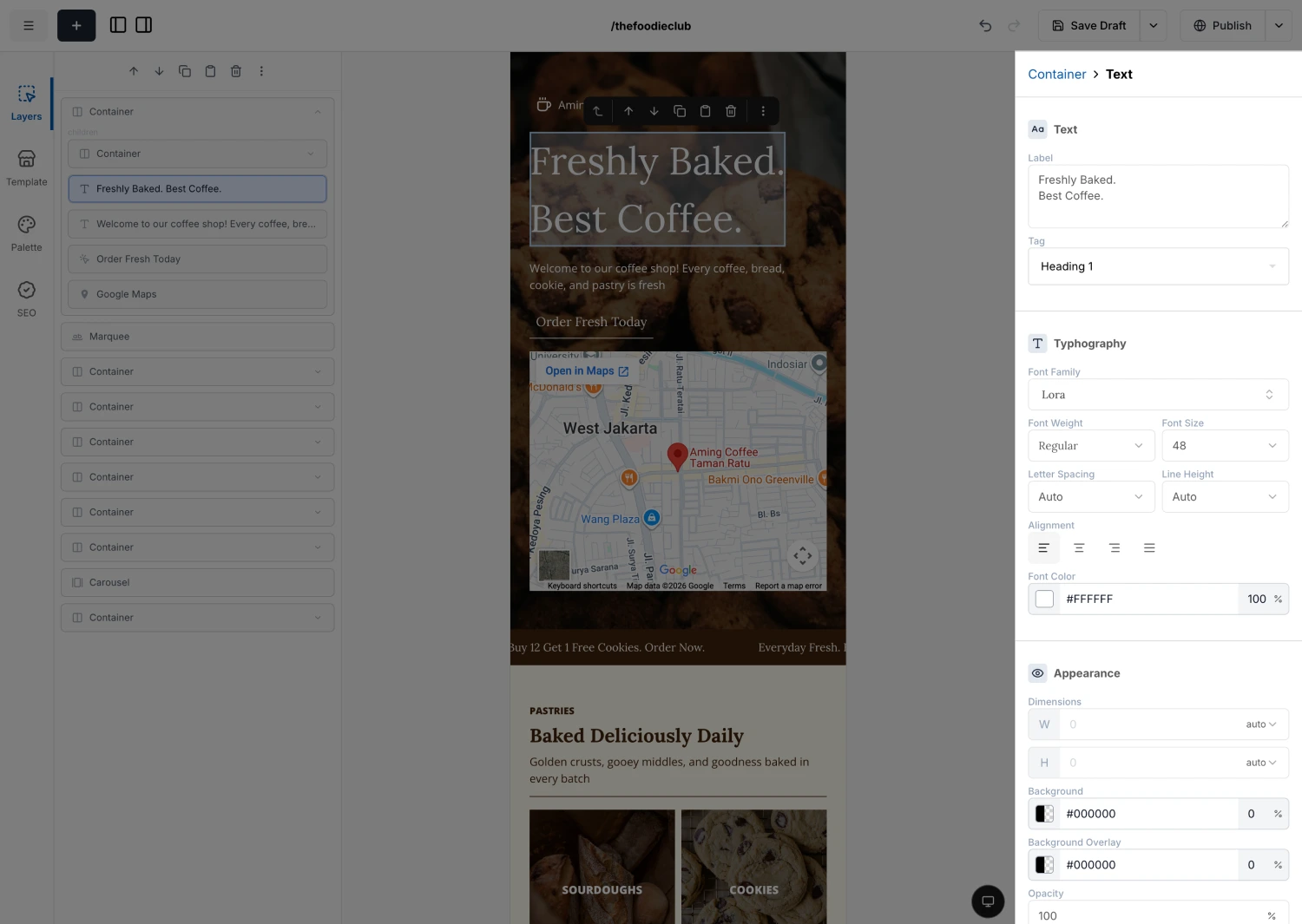
Select a component on the canvas. Its settings appear in the Fields panel on the right (the "Fields" tab of the Feature Rail), grouped into sections you can expand. The top sections are unique to that component. The lower sections (typography, appearance, border, and so on) are shared across most blocks.
Because those styling sections repeat everywhere, we document them once in Common Fields. Each component page then only covers the settings that are special to it.